Decathlon
User Experience Referent / Workshops Facilitator
2019 - 2022
How can we sports practitioners purchase experience seamless in-store seamless so they spend more time to practice sport than to wait in the queues? What would it take to build a digital surface where anyone, anywhere can easily find sports products they are looking for without endlessly scrolling? How do we close the gap between sports practitioner’s wants when there is low or no stock in store?

Autonomous Purchase Experience
Project Team: Amy Wang (Product Owner), Nicholas Lau (Developer), Juen Ren (Developer), Maxime Demouchy (Tech Lead), Hussain Dewani (User Experience)
A member-exclusive, express, and contactless checkout service at Decathlon store with the mobile-based user journey, empowered by RFID auto-scan technology.
A digital enabler for a new format store where this is no access limit on time.

Store user journey concept
Product Discovery
Project Team: Wendy Lau (Product Owner), Nicholas Lau (Developer), Joseph Leung (Developer), Marc Chamberlin (Tech Lead), Hussain Dewani (User Experience)
When I first joined Decathlon our online web experience was not meeting user comfort or helping them achieve their goals. My focus was to work with our product team two frontend developers, a backend developer, a data scientist, and a product owner, to accelerate our user experience.
Through customer feedback, user studies, visual analytics (click map, scroll rate, move rate), and usability analysis sessions, the website product team had come to learn the existing experience was a little difficult to use.
My team’s role was to work with each of the verticals of the technology and business side across the organization to understand simplify the experience of finding relevant products on Decathlon’s website and to envision how we might improve the user’s overall experience.
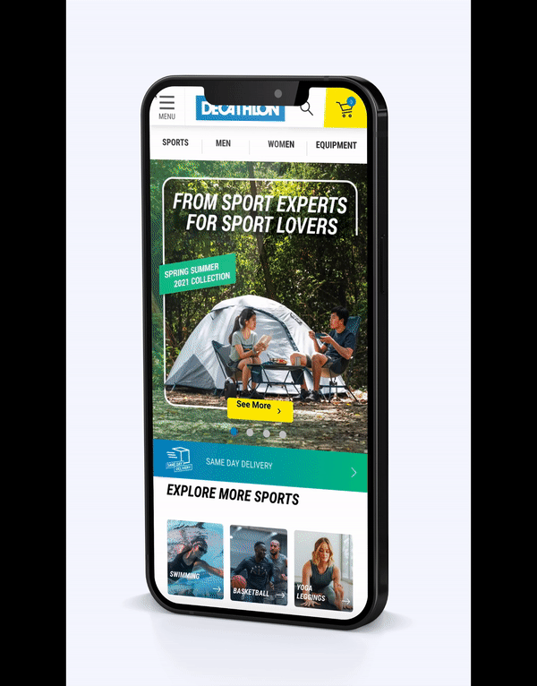
Sports Grouping & Visual Drivers on Menu Navigation
Visual elements are a crucial ingredient of a good UX in Hong Kong, as they produce the most engagement and fastest time to first click. Indeed, visitors in Hong Kong are among the first to click on the picture. Our users proved that images rule, with the shortest time to first click — +73% change on mobile users and +45% on desktop users. Increase in landing on listing page above +50% on mobile and +20% on desktop.
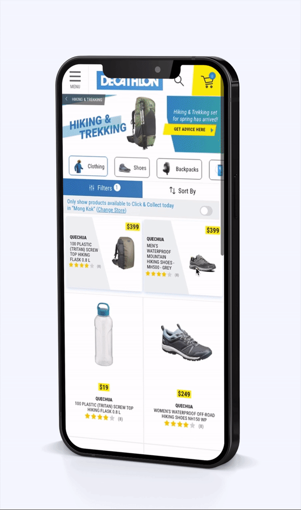
Clarity of Stock Availability on Category Page
The availability message on the listing page stopped the user from further exploring the product page, we identified that by putting conditions of the store network for products that are either available in-store or online with a clear message, we were able to increase the conversion rate by 7bps and unavailable products CTR by 3bps while also reducing the bounce rate by 59bps.
Visibility of Stock In-store
We realized that when the store doesn't have that product in stock, the website will display 'Not available'.
In order to provide a seamless checkout experience to the users as long as the stock is available either in-store or warehouse, we designed the feature to let them reserve stock in advance.
Within 2 weeks of the launch of this feature, we saw an increase of 22.5% in conversion of stock in-store.
Recommendation System
Project Team: Wendy Lau (Product Owner), Joseph Leung (Developer), Mohammed Abdelmonam (Developer), Kwan Ching Wang (Developer), Marc Chamberlin (Tech Lead), Louis Law (Data Scientist), Hussain Dewani (User Experience)
We realized that a chunk of our users are casual visitors and sometimes they are not sure of what to buy. In order to make sure users see the relevant product, we came up with a system that can mimic the role of an in-person staff, a system that can reduce the workload on users who are overwhelmed by the number of available options. Not just help in reducing options; typically, in a customer journey, customers go through stages like need, awareness, research, comparison, decision & purchase. Other than the initial need and final purchase stage, an intelligent recommendation system should be able to assist customers through the stages of awareness, research, and decision.
Essentially, the subject of recommendation reduces to statistical analysis of understanding users, products, and their relationships. The goal of the system design was to reduce the information or data that is useless and irrelevant for effective decision making and to stimulate buying action by the user.
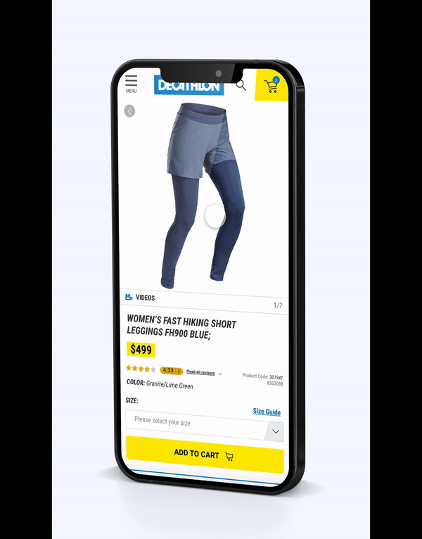
Ease in Purchase Journey
Project Team: Wendy Lau (Product Owner), Nicholas Lau (Developer), Joseph Leung (Developer), Hussain Dewani (User Experience)
When we realized that the users on our product page have a low advanced to cart rate, we investigated the situation and studied data of our users based on buying behavior and page visits. We realized that most of the users have a hard time finding relevant information which could support their purchase experience.
In order to help users learn more about the product and give the information they want, we optimized our product information structure and product reviews section while also letting them make an easy purchase at any point on the page.

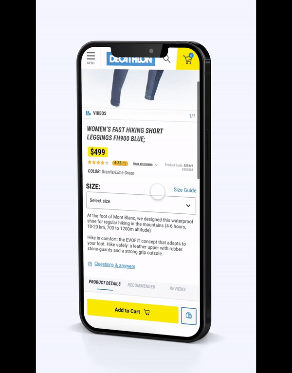
Sticky Navigation
We realized that among the top browsed page types, the product pages have the highest exit rate and bounce rate, with 50% of the users drop off in the first fold, and on average, they spend 12 seconds to scroll.
Our solution for quicker access was to segment the information by grouping them into; Product Details, Recommended Products & Product Reviews. Within 2 weeks of testing, we saw an increase in navigation usage by 4.8% with an uplift of cart-to-detail rate by 8bps.
Sticky Conversion
We understood that users spend a lot of time scrolling the page to find the cart button and which creates a hindrance in their purchase experience.
We modified our user’s experience by giving them access to the conversion button at their fingertips (literally) and created a sticky Add-to-Cart and Store button.
Product Reviews
According to our study, we learned that only 10% of our users will go back to the product page after reading the all reviews page. One of the key reasons why they have to an all reviews page is they cannot find relevant reviews on the same product page.
We came up with a concept to rank the reviews based on their usefulness to the sports users community where users can upvote the reviews.
